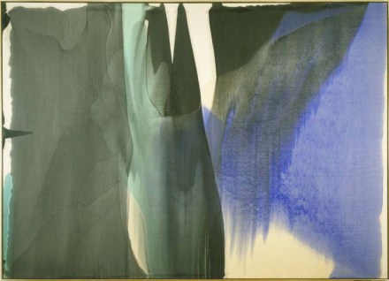
This post has nothing to do with books. It is just about the color blue.
Over the course of two days in DC, I visited two museums dedicated to Modern Art. One is the Philips Collection, which claims to be the first modern art museum in the country. The other is the National Gallery of Art’s East Wing.
Like never before, I was struck by how much Modern Art is about color – our construction of it, our emotional experience of it, our understanding of it, and lack thereof. Somewhere, I’d heard that before but had never actually felt it.

The Philips Collection houses room upon room of stunning works curated to reflect subject matter and evolving style, not always chronology. There is so much blue on its walls. Kandinsky blue, Marc blue, Picasso blue, Van Gogh blue, O’Keefe blue, Hopper blue, Louis blue, Chagall blue, Gaugin blue, Matisse blue.
And Rothko blue. Is there anything more heart-wrenching than Rothko’s stormy blue?

This museum actually has a small, specially commissioned Rothko room filled with the artist’s large-scale paintings. Each piece has three, four uneven blocks of color. Nothing else. But it manages to be a very sad place. One piece, a combination of blush, navy and mustard, is particularly devastating.
As the Gallery’s East Wing was under extensive renovations my husband and I popped into the more classical West Wing, where key pieces from the East Wing were on display. Here we saw Johns blue, LeWitt blue, Mondrian blue, Calder blue, even some more Rothko blue.

After two days of blue immersion, I was ready to go home convinced of blue’s unique advantages as a color. 150 years of Modern Art confirmed how effective blue is at making us empathize with a canvas or sculpture.
Then, on our way out, we passed an exhibit of Italian Renaissance painter Piero di Cosimo. The mostly earth-toned, religious tableaus were brought to life by carefully placed doses of Aegean azure, more dazzling than any shade of blue mixed on a modern palette.

I suddenly realized that modernity’s exploration of blue merely continues the work of the Renaissance masters. Although I visited the Vatican many years ago, I remember a few things with clarity – Michelangelo blue, Raphael blue, and the purgatorial duration of the tour.

In Medieval art, blue is used to signal the main, most holy characters in a painting. The Virgin Mary is usually cloaked in blue, as is baby Jesus, because the color is symbolic of heaven, of the divine.
Though the use of blue in Modern Art might not seek to reflect the realm of the heavenly, it certainly acknowledges the color’s ability to connect us with something higher. Why blue can do this remains an interesting question. Perhaps it has to do with the sky’s hue. But then, why, ultimately, is the sky blue? Refracted light aside, someone had to have made that choice.

In closing, I wanted to give a shout out to museums. They are the internet, before the internet. How else could we witness centuries’ worth of painted blue in a single day? History fades if it is not recorded and revisited. Thank you, museums for recording history in a way that is fun to revisit and for making sure that our kids’ visual intelligence won’t be nourished solely by disposable Instagram feeds.
